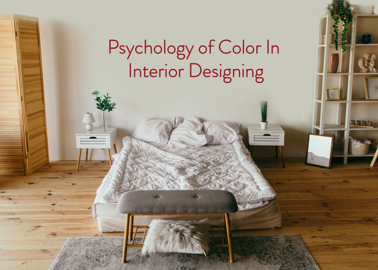
Whether you’re moving into a new house or remodeling an existing one, you’ll have a lot of choices to make. In many cases, nothing is more crucial than deciding on a color scheme. Color can be added to a space by painting it, using wallpaper, choosing vivid window treatments, or strategically placing toss pillows or a rug. When it comes to designing your home, choosing a color palette is both the most significant and the most difficult task.
Basic color theory is both a science and an art form. You could be surprised by the psychology of color in interior design. Color has the power to influence mood, ambiance, and sensation. The amount of colors you can use in your home is limitless.
Below, we have listed some of the basic colors as well as their significance when it comes to interior designing and how to use them in your home decor.
Red
When we think of the color red, we think of passion, energy, and excitement. It has a psychological effect and might raise the heart rate. Red is commonly utilized in kitchens because it aids with hunger stimulation. Red should be avoided in the bedroom si it often interferes with relaxation and sleep.
Blue
Blue has the calming effect you need to drop your heart rate and blood pressure. As a result, several tones of blue are frequently employed in bedrooms. Blue is also a cooling color, making it ideal for hot areas. Lighter colors of blue might help to make a small area appear larger. Consider incorporating blue into your kitchen if you want to curb your hunger and lose weight.
Yellow
If you want to lighten up your environment, yellow could be the color for you. Sunlight and cheerfulness may be added to your surroundings by using pale yellow to honey-gold tones. Yellow can help you remember things, boost your creativity, and make your home feel more optimistic. It’s critical to choose the proper shade of yellow to achieve the desired impact.
Green
Green happens to be one of the most soothing colors available in abundance in nature. We at Studio Vibhasa like to use greens in fabrics, wallpapers, and accent highlights. Green, often considered the most relaxing color for the eye, may convey a sense of peace and security. Greens can be used to create contrast, drama, richness, and balance throughout an entire room.
Gray
When we think of grey, we think of a color that isn’t black or white. It draws little attention to itself due to its lack of color, and it maintains its distance, remaining independent. Gray is a good choice when it comes to designing Industrial surroundings that are both utilitarian and functional
White
A room that has been painted white has the effect of making the space look bigger while simultaneously bringing a sense of calm and austerity to the room. However, too much white can also end up looking clinical. The trick here is to combine the color white with soothing earthy colors, making the space meditative.
Color has a significant impact on a space and the people who inhabit it. And it is crucial to keep the aim of a space aim in mind while selecting colors.
Check out our Instagram feed to learn more about how we have used color in the various projects that we have worked on.